


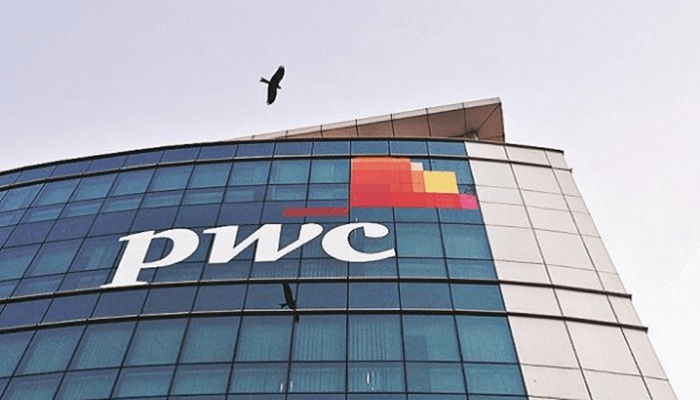
PwC has introduced a new global brand identity at a time when the firm is facing intense internal challenges, including layoffs, budget cuts and employee discontent. The updated logo keeps the original font but replaces the firm’s colourful ‘butterfly’ design with two plain orange parallelograms. This is PwC’s first global rebranding in over a decade.
The change has sparked widespread criticism, particularly among employees and industry watchers. Many see it as poorly timed and tone-deaf. Staff across platforms such as Reddit and LinkedIn have voiced frustration over the firm’s decision to invest in branding while thousands lose their jobs. The backlash highlights deeper dissatisfaction as PwC pushes through cost cutting and restructuring measures.
Over the past year, the company has laid off hundreds across multiple countries. In the US, it cut around 1,800 jobs in late 2023—its first formal layoff since 2009. In the UK, quiet exits and unannounced redundancies have further unsettled employees. Simultaneously, the firm ended its tech apprenticeship programme and let go of more than 120 partners. Insiders say these measures are meant to protect partner payouts amid a downturn in consulting demand.
What further fuels employee anger is PwC’s continued investment in external partnerships. The firm recently announced a consulting partnership with Formula 1, which has been criticised for its flashiness and disconnectedness from the financial realities within.
Brand experts have also questioned the creative value of the rebrand. The minimalist logo has been called uninspired and symbolic of the firm’s stripped-down operations. With costs for the rebrand likely reaching millions globally, many feel the money could have been better spent on people, not aesthetics.
The timing and execution of the rebrand seem rushed, expensive, and far away from employee concerns.
Source – https://www.hrkatha.com/news/pwc-faces-backlash-over-costly-rebrand-amid-layoffs-and-restructuring/